Are you looking for the best way to make your website responsive? Responsive web design has dominated websites across the world for years, transforming the way businesses build and manage their online presence.
A responsive website is one that can adapt to the screen it's being viewed on, regardless of the device. The site automatically reshapes and restructures itself to deliver a better user experience, fitting the device perfectly. This can bring your business or brand's website a range of benefits, while also aligning with Google's recommendations.
Adaptive web design was introduced in 2010 and web designers began recommending it from 2015 onwards. Since then, responsive design has continued to improve and has become a central factor in areas as important as web indexing.
Why responsive web design matters
In recent years, smartphone usage has grown exponentially. We know that in 2014 only about two thirds of people in Spain had a smartphone. Since then, the spread of the internet, 4G and other innovations changed the way people use mobile devices. During 2014 alone, 4G subscriptions surged.
By the end of 2016, mobile web usage had overtaken desktop for the first time — showing just how many people were already browsing on smartphones and tablets rather than laptops or desktops. This marked a sharp shift in how people use their mobile devices: from that point we began using them to shop online, do our banking and use social media.
For all these reasons, investing in responsive web design became critical: your business needs a website that works well on a smartphone or other mobile screen, since the vast majority of people who might visit your site are likely doing so from a mobile device.
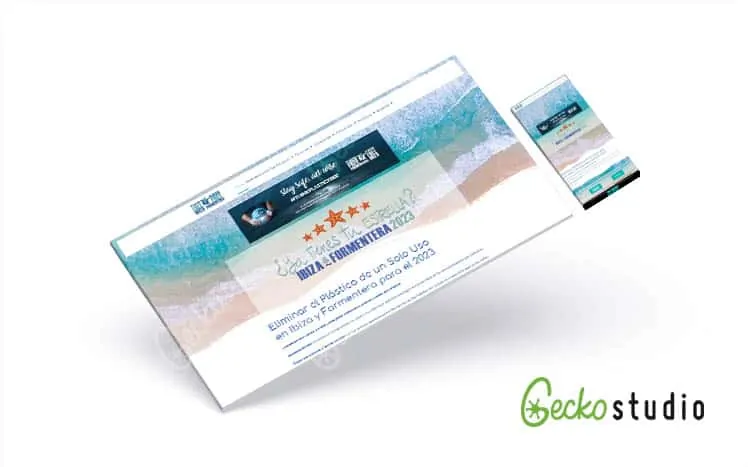
Today a responsive website is essential. At Gecko Studio, all our web designs adapt to every type of screen.
What does Google say about responsive design?
Google issued recommendations in 2015 around responsive web design and began rewarding sites that were fully optimised for mobile platforms. Google started using mobile compatibility as a ranking boost in search results, and businesses began taking note.
More recently, Google went further and has been rolling out mobile-first indexing strategies. Mobile-first indexing is based on ranking and indexing the mobile version of a site, rather than the desktop version. If you already have a responsive web design, you won't need to make any changes.
From 2018 onwards, Google announced it was migrating sites that followed responsive best practices towards the top of its index. Previously Google crawled and indexed the desktop version of a website, but it began to notice this caused problems for mobile users. Mobile-first indexing means Google primarily crawls, indexes and then ranks the mobile version of a site. Because of this, it's now more important than ever not only to have a responsive web design, but to have a solid, well-built mobile version of your site.
Benefits and importance of responsive web design
With a responsive web design, all your content and pages are flexible and adaptable across every screen resolution and device. Whether someone is viewing a page on a smartphone or a laptop, navigating it will be straightforward regardless of screen size. By delivering an optimal user experience across the board, responsive web design lets users read and navigate your site with minimal resizing and very little scrolling.
Responsive web design improves the user experience, which translates into a more positive perception of your brand and business. If your customers can access your site easily on all their devices, they're more likely to come back and, in the short term, that almost certainly means a higher conversion rate for your site. In a world where so much traffic comes from mobile devices, this factor deserves serious attention.
Responsive web design on mobile is important for indexing, as mentioned above. These sites generally load faster, which is likely to improve your Google rankings and reduce your bounce rate. Good responsive design can also make it easier to share your web content, helping you grow faster.
SEO campaigns and website maintenance are also much simpler when your site works across all mobile devices. Having a responsive web design means a faster site that's built around the user's needs, and it's far less costly than building a separate mobile app alongside your website.
Since mobile-optimised websites are now an industry standard — especially with mobile-first indexing in place — making sure your site is fully adapted is well worth the effort.
Get in touch to find out more about making sure your website design is exactly right.
Our SEO agency will help you improve your rankings in search engines. For specialist advice, speak to our SEO consultant.